


Revik Wine Co.
Creating intimacy and capturing history for a young winemaker’s inaugural brand
Owner and winemaker Phil Holbrook came to us with an aesthetic open mind and complete dedication to getting his first cuvées’ labels right. Starting from this blank canvas, together we mined his inspirations, influences, and intentions to create a deeply personal and timeless visual identity and labels for Revik’s launch.
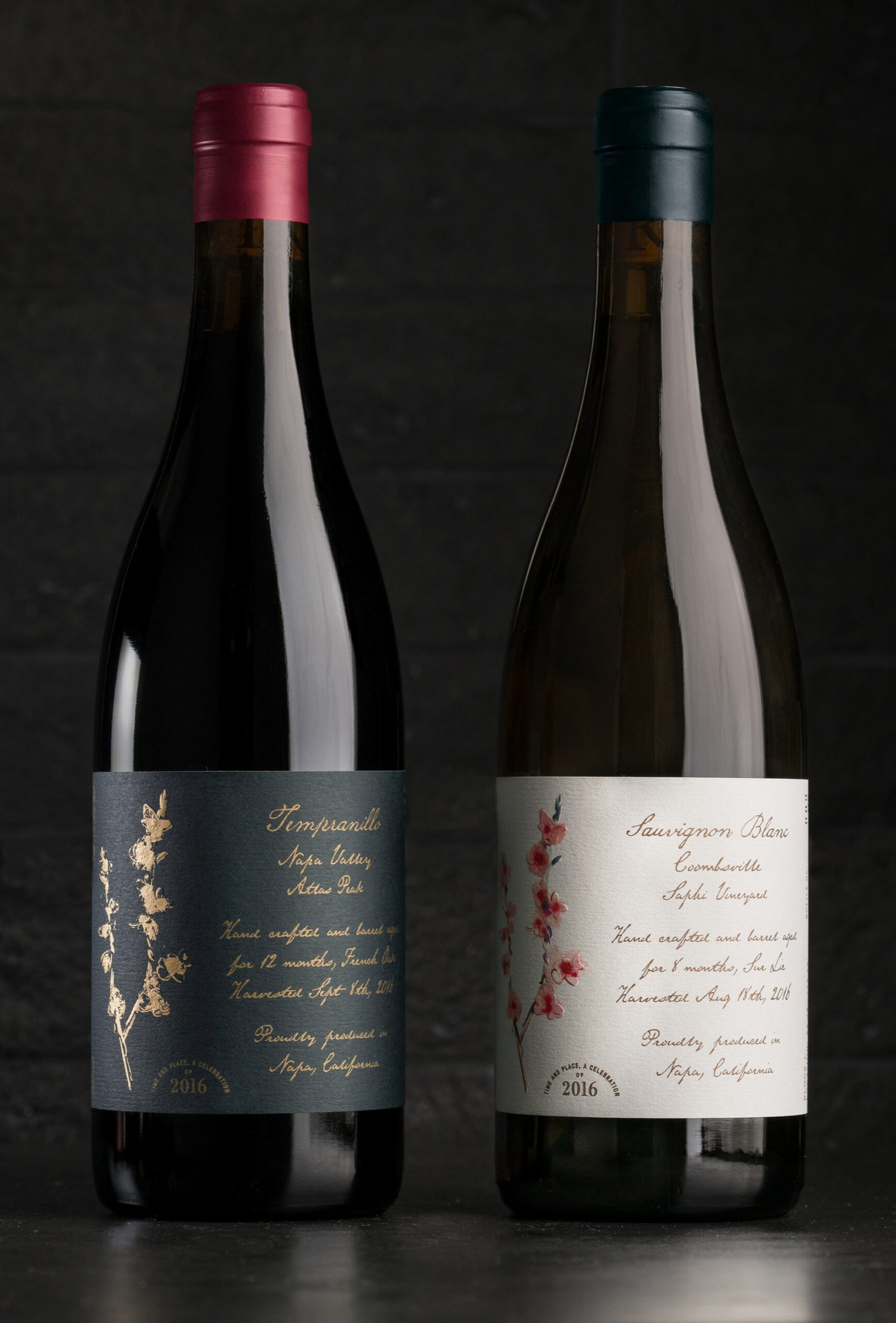
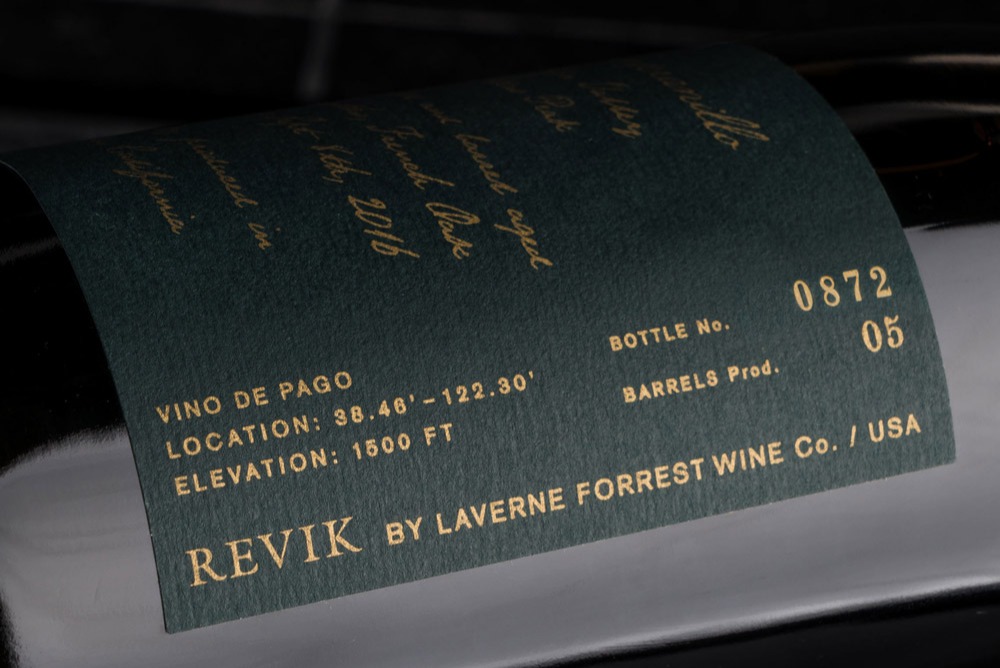
A simple blue and white label system allows for quick red vs. white distinction (and easy portfolio expansion).
Original artwork with a nod to legacy
The cherry-blossom illustration, created by his grandmother Margrit Mondavi, reflects both Phil’s familial reverence and value of wine as a connector and conduit for stories. With a layout and script inspired by Margrit’s legendary hand-drawn menus, each label features a story of the cuvée more prominently than even the brand itself. As a brand intended to be a “hand sell,” the label beckons to be pulled closer for the details to reveal themselves.
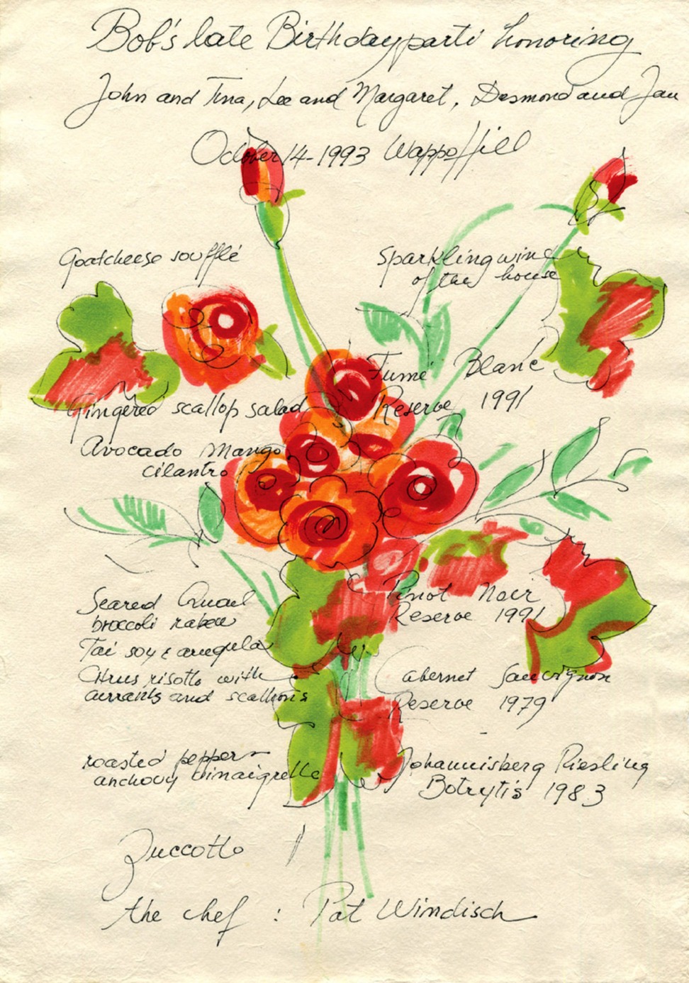
The inspiration: One of Magrit’s Mondavi's original menus which she created for every meal hosted in her home.
Phil Holbrook“Offset is the best in the game! What they were able to pull together, from just a couple of artwork samples – it was perfect, and also brought more of an appreciation for my grandmother and her work. It kept her alive.”
How we did it
Offset Brand Studio
Revik Wine Co. also engaged us for
Offset Brand Studio
Offset Commerce