Arkenstone
Evolving and unifying an expanding portfolio
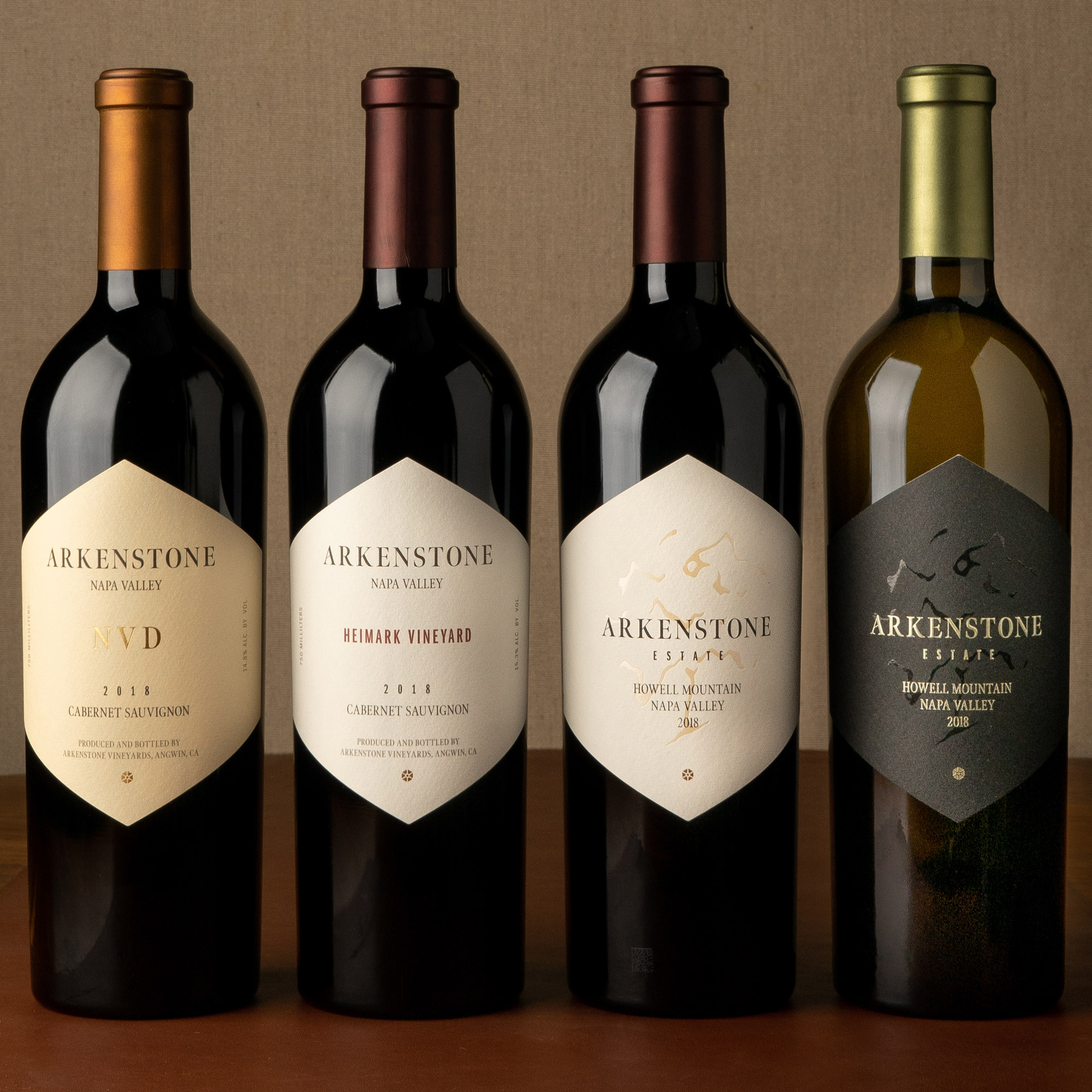
As wine producers add existing wines and tiers to their portfolio, the limits of their original package design systems are often tested. As Arkenstone’s portfolio was expanding with single vineyard and reserve wines, they realized their existing packaging wasn’t distinguishing tiers clearly at a glance, and that they’d need to reevaluate their complete label line-up and tier structure.

The evolved visual identity and packaging system. Pictured second to left and far right, the new tiers that spurred the project.
Before and after
Arkenstone was clear from the getgo that they wanted to respectfully evolve their visual identity and packaging, rather than pursue a revolutionary change. Given the strength of their original visual brand elements, we couldn’t have agreed more. That said, we were upfront about our definition of evolution. From our deep experience working on label evolutions, we are firm believers that the feel and visual recall of a package can be sustained even with dramatic changes to individual elements.
Detailing the visual identity system
We deliver visual identity specifications along with assets as part of all of our packaging projects. In wine, this is especially important, as the way that brand elements appear on the bottle shouldn’t always be the way they appear online or in a sharable logo. Case in point: note the differences in the use of the logotype, jewel symbol, and the Napa Valley text between the package and the primary logo lockup below.
“It was very important for us that the key staples from our original label and logo were maintained as that is how our customers know our brand and how we are recognized in the market.
Working with the Offset team, we were able to really dig into the design assets that were meaningful to us. Together we developed a road map that lead us to a more modern, but still classic representation of our brand. We put our trust in the Offset team, and they delivered.”
Jake Krausz
Estate Director, Arkenstone


