Frog's Leap
Updating one of wine’s most iconic labels: the risk and the opportunity
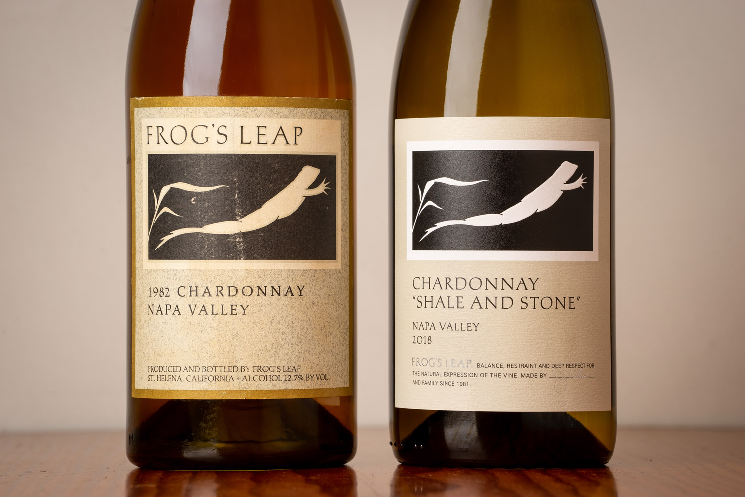
Originally designed by Chuck House in 1981, the Frog’s Leap label is renowned by oenophiles and casual drinkers alike, and included in the Smithsonian Institute’s permanent collection. So, why on earth were we asked to redesign this legendary label?
Legacy producers usually pursue redesigns when core aspects of their business – often ownership or mission – have changed. But Frog’s Leap has been family-owned and operated since its inception, with winemaker and proprietor John Williams still at the helm, and the winery’s commitment to sustainable agriculture and restrained, terroir-driven style of winemaking has not wavered. Instead of signaling a change, leadership was curious if a new label could better capture their longstanding values, approach, and brand. Through a robust discovery phase with internal and external stakeholders, we narrowed the brief to three questions:
• Could the label be more timeless to attract new customers better?
• Could the label speak more clearly about what’s in the bottle and the philosophy behind it?
• Could an evolved label reinforce the seriousness of the wine without removing the whimsy that contributes to its memorability?

Removing the unnecessary to allow room for better communication
Central to our creative process were experiments in subtracting elements from the existing label. What could be removed without losing the brand recognizability and impact? We discovered that Frog’s Leap possesses a name that – through strong design and years of market presence – is in fact interchangeable with its logo. When we removed the large Frog’s Leap logotype from its symbol, we unlocked three key opportunities:
• We could create intrigue for the uninitiated and reinforce its icon status by letting the leaping frog emblem stand on its own.
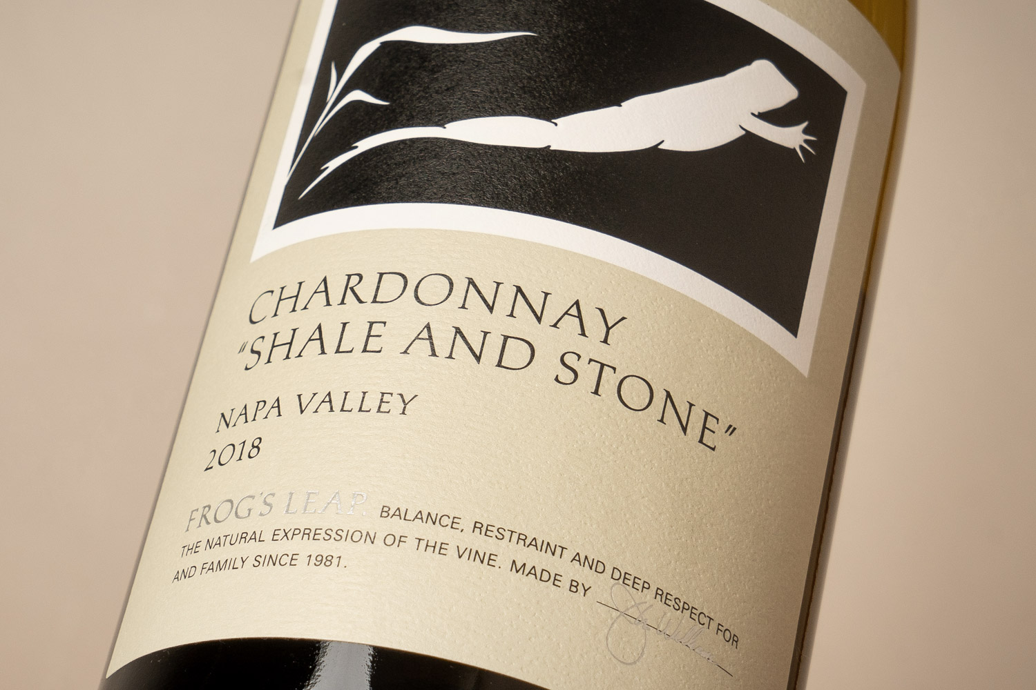
• We could reinforce what’s in the bottle by letting variety take center stage.
• We could speak to the soul and vision of the winery with a brand statement about philosophy, tenure, and family.

For a more timeless label, we removed the speckled paper and multiple borders – both of which were common wine packaging trends in the late ’70s and early '80s California wine. When bringing variety to the center stage, we updated its typeface to be a thinner, more elegant cut of the lettering used for the Frog’s Leap logotype.
A packaging design system that unifies
and distinguishes
An essential component of any packaging project is defining a system that has well-defined rules for individual wines, tiers, and potential future growth. For Frog’s Leap, we created a unified system that leverages the immense power of the recognizability of their core label, while still leaving room to distinguish individual wines.
Guidelines for beyond the label
Even small changes to a winery’s label can cause significant chain reactions in all aspects of the winery’s visual brand. With all of our packaging projects, we translate our work into comprehensive guidelines to ensure consistent and purposeful use by winery staff and outside collaborators. Rather than being created as a rigid, unchanging guide, our assets and guidelines are tested, refined, and re-documented as brands evolve.


