RAEN
Leveraging tradition and place for a young producer with deep wine roots
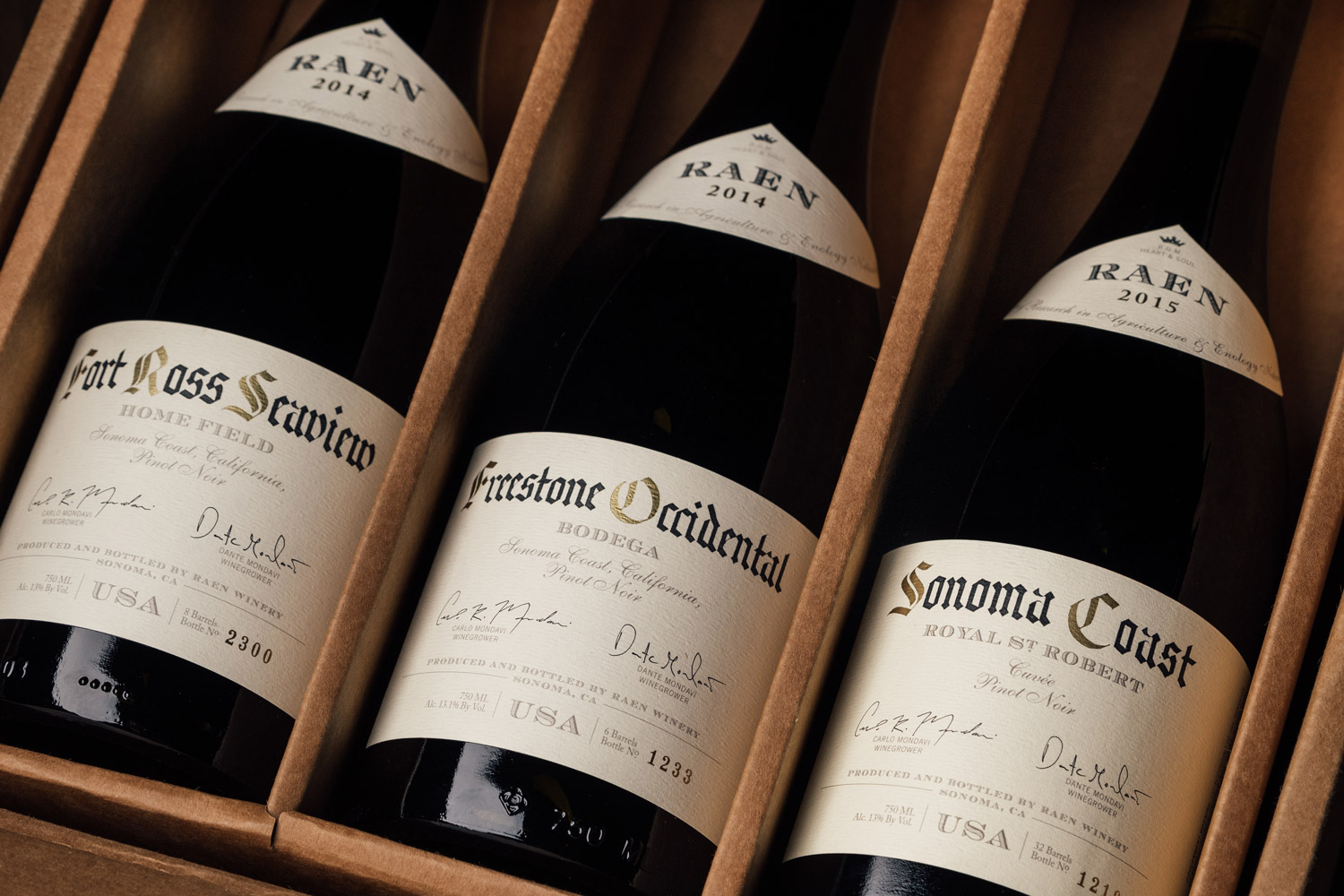
The vernacular associated with wine extends to every aspect of the product. Traditionally, bottle shape, glass color, and label design all speak directly to what is housed within. When embarking on their first solo project, third-generation winegrowers Carlo and Dante Mondavi were particularly concerned with getting it right. The visual identity and packaging for RAEN draws directly from the classic Burgundian wines that served as inspiration for the emerging brand; our design purposefully incorporates the layering of multiple typefaces and idiosyncratic details that add to the charm of the source material.

Working with a specialist to execute the details
properly
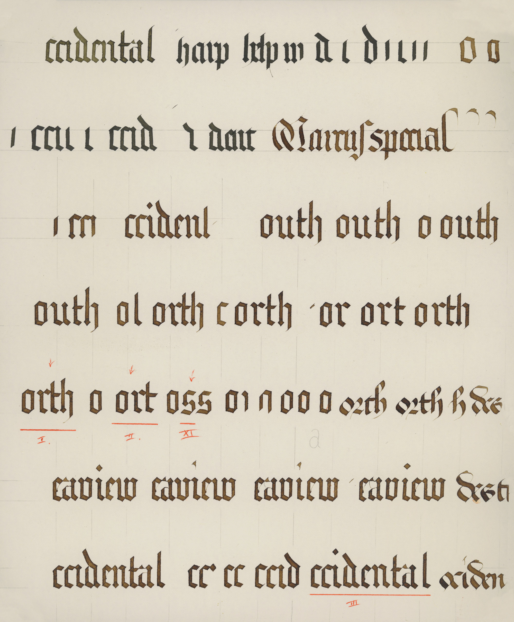
Because place is elevated above all else (even brand name), it was particularly important that the lettering was distinctive to the brand. In our conceptual work, we identified a particular style of blackletter as being appropriate, but rather than opting for an off-the-shelf typeface we commissioned a blackletter specialist to hand letter each prominently featured appellation. To reinforce the analog process, we left visible brush marks in the final letterforms.

One of many blackletter studies traded in pursuit of getting the letterforms just right.
Seeing the work through, from concept sketch to press check
We’re still shocked by how subtle details in printing can make or break a design. The adage that directors always hate the first cut of their film has eerie parallels for the first label pulled off the press. For this reason, we insist on attending inaugural press checks and working with the printer and our clients to refine elements on the spot.
RAEN also engaged us for
Offset Brand Studio
Offset Commerce


